
Binary vs. Binary (unpaired/independent)
Visualisation
With two binary variables, the cross table will have four cells. A visualisation might not be needed. You could of course use any of the visualisations discussed in the Nominal vs. Nominal section. If you have a clear dependent and independent variable, then a so-called clustered bar-chart might be useful, if not then a spine plot could be a good choice. Also a Butterfly chart might be an option.
Below an example of each of them.
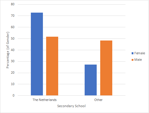
Clustered (or Multiple) Bar Chart
A multiple bar-chart can be defined as: “a bar chart for comparing the frequencies of a categorical variable in two or more situations” (Upton & Cook, 2014, p. 283).. The term 'clustered' is used for example by SPSS.
Click here to see how you can create a clustered bar-chart ...
with Excel
Excel file: VI - Bar Chart - Clustered.xlsm
with SPSS
There are a two different ways to create a clustered bar chart with SPSS.
using the chart builder
Data file: GSS2012-Adjusted.sav.
using legacy dialogs
Data file: GSS2012-Adjusted.sav.
See the visualisation section at Nominal vs. Nominal for more info on Clustered bar chart
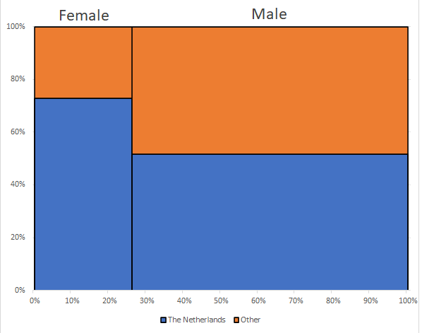
Spine Plot
Click here to see how to create a spineplot...
with Excel
It might take some time, but it is possible to create a spine plot with Excel, as shown in the video below.
Excel file: VI - Spine Plot.xlsm
with SPSS (not possible)
Unfortunately I am not familiar with a way to create a spine plot in SPSS using the GUI. It might be possible by using some syntax (linking perhaps to R), but that goes beyond the scope of this course. I'd suggest using MS Excel instead.
There is a macro from Wheeler that should make it possible: https://andrewpwheeler.com/2013/04/21/spineplots-in-spss/ , but I have not tested this myself.
See the visualisation section at Nominal vs. Nominal for more info on Spine Plots
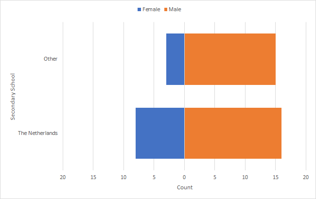
Butterfly Chart
See the visualisation section at Binary vs. Nominal for more info on Butterfly Charts

Google adds