
Analysing an ordinal and a scale variable
Part 1: Impression
To begin analysing if there might be differences between different groups on their scores on a scale variable, we might begin by comparing some statistical measurements. Usually I'd recommend to start with a frequency table, which can still be useful, but if the range of the scale variable is very big it might not be very insightful.
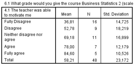
The statistical measures of interest with a scale variable are usually the average (strickly speaking called the arithmetic mean) as a measure to indicate the center, and to indicate a bit about the variation the standard deviation is often reported. For example a course we would like to know if there is a relation between the ability from the teacher to motivate the students (5 point scale fully disagree to fully agree), and the grade students gave for the course (ranging from 0 to 100, with 100 being perfect). Table 1 shows the descriptive measurements.
Click here to see how to determine these values with SPSS, with R, or with Excel.
with SPSS
Three methods on how to obtain the means and standard deviation per category
using Means
using Explore
using Split file
with R
with Excel
In the table we see the average (mean). We can see that it seems that the more students agreed with the statement, the higher also the average grade given for the course.
The last column shows something about the variation, measured by something known as the standard deviation. It shows roughly how much each score was above or below the mean. A high standard deviation indicates a high variety in scores, which could indicate that people disagreed with each other, or that something is very unstable. In the example in the highest variation was in the disagree category, it might indicate that some students although they disagreed with the statement, still evaluated the course overall higher.
A visualization might actually be more helpful and easier, which will be discussed on the next page.

Google adds