
Figure 1. Example 1 of a bar chart
(this site uses frames, if you do not see the weblecture and definitions frames on the right you can click here, if you don't see a menu on the left and want to go to the home page click here)
As the name implies a bar-chart is data represented by bars.
| Bar chart “a graph in which bars of varying height with spaces between them are used to display data for variables defined by qualities or categories” (Zedeck, 2014, p. 20). |
It is a common type of chart for discrete data. An example of a bar-chart is shown in Figure 1.
Figure 1. Example 1 of a bar chart
In the example we can tell the number of Clerical workers is above 350, Managers around 75 and Custodial around 25.
Note that the width of each bar is equal, there are gaps between the bars (to emphasize the discrete character), and the vertical (y) axis represents the frequencies. The Oxford Dictionary of Statistics adds that the width of the bars and the gaps should not be equal (Upton & Cook, 2014, p. 29), but I have yet to come across any other source to mention this as well.
When looking at a bar chart check if the vertical axis starts at zero. Figure 2 shows two bar charts, made from the same data.
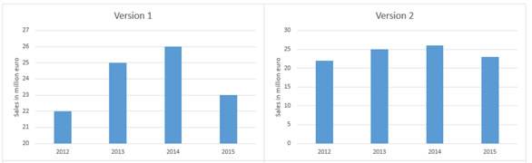
Figure 2. Two bar charts from the same data
In version 1 the differences between each year seem to fluctuate a lot, while in version 2 it seems more stable. This is because in version 1 the vertical axis starts at 20, while in version 1 it starts at 0. Although this technique is very old and popularized in Huff’s How to lie with statistics (1954), it is sometimes actually preferred not to start at 0. Small fluctuations on a stock market for example can have a very big impact. If the scale would then start at 0, these would perhaps not even be visible. Sometimes a small squiggle is inserted to highlight that the axis does not start at 0, and sometimes an entire break in the graph is used.
It is also important to check what the vertical axis actually represents. In Figure 3 two more bar-charts, still from the same data.
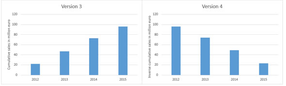
Figure 3. Two more bar charts from the same data
In version 3 the sales seem to increase each year, but this is only because it actually shows cumulative sales, and not the regular sales. Cumulative is almost always increasing, so the chart will then almost always show an increase. The opposite effect occurs when you take the inverse cumulative, this will almost always show a decline.
As a guideline for the size of the bar there is a rule of thumb known as the 'three quarter high rule' (Pitts, 1971). It means that the height of the y-axis should be 3/4 of the length of the horizontal x-axis. So if the horizontal axis is 20 cm long, the vertical axis should be 3/4 * 20 = 15 cm high.
According to Singh (2009) vertical bars (instead of horizontal bars) are preferred since they are easier on the eye. However if you have long category names some names might become unreadable. A bar chart with the bars placed horizontally might then be preferred. Figure 4 shows one of the earliest found bar-charts from William Playfair (1786) that has the bars placed horizontally.
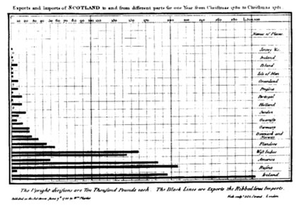
Figure 4. Earliest known bar chart. Reprinted from The commercial and political atlas (p. XX), by W. Playfair, 1786, London: Debrett; Robinson; and Sewell
There is an earlier bar chart by Oresme (1486), but that is used more for a theoretical concept, than for descriptive statistics.