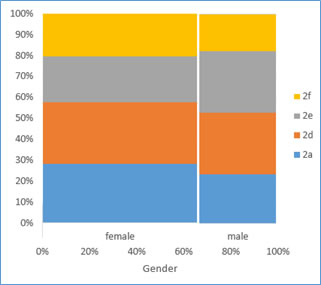
Figure 1. Example of a spine plot
(this site uses frames, if you do not see the weblecture and definitions frames on the right you can click here, if you don't see a menu on the left and want to go to the home page click here)
A spine plot is a specific type of mosaic plot for only two variables. It is similar to the compound bar chart, but now the width of the bar is set by the proportion of each horizontal category.
| spine plot a compound bar chart showing multiple bars stacked at each x-axis category, the width of each stacked bar is proportional to the total of the entire category. |
The term spinogram is sometimes also used, when the stacked variable is a binned scale variable.
An example of a spine plot is shown in Figure 1.
Figure 1. Example of a spine plot
Spine plots have been used for a long time. One old example can is from Walker (1874) which is shown in Figure 2.
Figure 2. Early spine plot. Adapted from F.A. Walker, “Statistical Atlas of the United States Based on the Results of the Ninth Census 1870”, p. PI XX, Census Office: New York, NY
Hummel is often attributed to be the first to name these spineplot but unfortunately I have not yet been able to obtain his original article 'Linked bar-charts'.