
Binary vs. Nominal
Visualisation
We can use any of the visualisations discussed in the Nominal vs. Nominal section. If you have a clear dependent and independent variable, then a so-called clustered bar-chart might be useful. However specifically if the independent variable is the binary one, a Pyramid(/Butterfly/Tornado/Divergent Bar) chart might be a good option. If you do not have a clear independent and dependent variable a spine plot could be a good choice.
Butterfly/Pyramid/Tornado/Funnel Chart
In the case of an independent binary variable, and dependent nominal a chart that is showing the bar-charts for each of the two categories, back to back is useful. The terminology for this kind of chart is very unclear. I use the following. Since a pyramid has a large base and a small top, I will consider in the case of a nominal variable the pyramid chart to be sorted like that, a tornado chart is then the opposite (large top, small base) and the same as a funnel chart. If there is no sorting a butterfly chart. The butterfly chart is then a special case of a divergent bar chart. A divergent bar chart could be for multiple bars that are each split in multiple parts, while the butterfly are multiple bars each split in only two.
The term 'back-to-back' is also sometimes added, since in theory you could make a Butterfly/Pyramid/Tornado/Funnel Chart with just one variable, and not split this between two categories. In practice though I hardly ever see this being done.
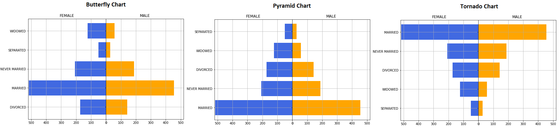
Figure 1 shows an example of the three diagrams (Butterfly, Pyramid and Tornado/Funnel)
Figure 1.
Butterfly, Pyramid, and Tornado Chart.
Click here to see how you can create a Butterfly/Pyramid/Tornado/Funnel chart ...
with Python
video to be uploaded
Jupyter Notebook: VI - Butterfly Chart.ipynb
Data file: GSS2012a.csv.
with SPSS
to be uploaded
As can be seen from figure 1, the data is the same, just a different ordering. It seems that for both Male and Female the order of the categories is the same (most male were married, and most female as well, then never married, etc.). There don't seem to be any categories with large differences between male and female, but we can test if there still might be.
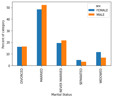
The other alternative charts mentioned were the clustered bar-chart and the spine plot. An example for each is shown below
Clustered (or Multiple) Bar Chart
Click here to see how you can create a clustered bar-chart ...
with Excel
Excel file: VI - Bar Chart - Clustered.xlsm
with SPSS
There are a two different ways to create a clustered bar chart with SPSS.
using the chart builder
Data file: GSS2012-Adjusted.sav.
using legacy dialogs
Data file: GSS2012-Adjusted.sav.
See the visualisation section at Nominal vs. Nominal for more info on Clustered bar chart
Spine Plot

Click here to see how to create a spineplot...
with Excel
It might take some time, but it is possible to create a spine plot with Excel, as shown in the video below.
Excel file: VI - Spine Plot.xlsm
with SPSS (not possible)
Unfortunately I am not familiar with a way to create a spine plot in SPSS using the GUI. It might be possible by using some syntax (linking perhaps to R), but that goes beyond the scope of this course. I'd suggest using MS Excel instead.
There is a macro from Wheeler that should make it possible: https://andrewpwheeler.com/2013/04/21/spineplots-in-spss/ , but I have not tested this myself.
See the visualisation section at Nominal vs. Nominal for more info on Spine Plots
All of the charts don't seem to show any big differences between the male and females, but we can test if there still might be.

Google adds