
Analysing a binary vs. scale variable
Visualisation: Split histogram
To visualise the sample data between a binary and a scale variable various options exist, but two commonly used ones are a side-by-side box plot and a split histogram. For each of these options something can be said. The side-by-side box plot is a visualisation of some descriptive measurements, and therefor a bit more technical.
For the example used on the previous page, I'll use a split histogram such as the one shown in Figure 1.
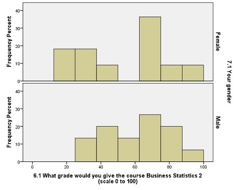
Figure 1. Gender vs Grade for course.
Click here to see how to create a split histogram with SPSS, with R, somewhat with Excel, or Python.
with SPSS
with R (studio)
with Excel (somewhat)
Unfortunately it is not possible (to my knowledge) to create a singele chart that shows a split histogram, however you could mimic the result by showing three different histograms and place them underneath each other.
with Python
With Python I actually prefer to overlay the two histograms on top of each other, as shown in the video.
but if you want, also the split-version is possible.
The number of bars (bins) can change the look of this. There are various formal rules on how many bars there should be, and even more rule of thumbs. I recommend using between 5 and 12 bars. In this example I've used 8.
From Figure 1 we can see that it appears that the female students where split on the grade for the course (which explains the higher standard deviation), while the male students were less varied in their opinion. To find out if the average (mean) score of the female students, is significantly different from the male students, we will need to use a statistical test. This will be the topic of the next section.
As mentioned earlier an alternative visualisation is to use a box-plot
Click here to see how to create a boxplot with SPSS, with R, or with Excel
with SPSS
with R
with Excel
The video below shows how to create a boxplot with Excel 2016, for earlier versions of Excel read the instructions on this site (opens in new tab).

Google adds