
Nominal vs Nominal
Part 1: Impression
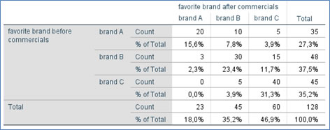
To get started we might want to get a first impression of the sample data by generating a cross table (also known as contingency table), as shown in Table 1.
Click here to see how you can create a cross table as above, with SPSS, with R, or with Excel.
with SPSS
There are a two different ways to create a cross table with SPSS.
using Crosstabs
using Custom Tables
with R
with Excel
In the example used, people were asked their favorite brand, then shown a commercial from each and asked the same question again. The percentages in the Table are based on the grand total. We can see now for example that 27.3% preferred brand A before the commercial, but only 18% preferred brand A after the commercial.
If you are only interested in comparing these column percentages, you can also minimise the table and only show the totals as shown in Table 2.
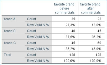
Click the button below to see how to create a table as shown in Table 2....
with SPSS
It seems the preference for brand A has declined after the commercials, while for brand C it increased. From Table 1 we can see that 10 people moved from A to B, but also 15 people moved from B to C.
It might be helpful to visualise the results, which will be discussed on the next page.

Google adds