
Analysing two ordinal variables
Part 2: Visualisation
My choice of a visualisation to show the relation between two ordinal variables is a so-called heat map, which is actually simply a color-coded cross tab. Continuing with the example from the previous page, a heat map of the cross table is shown in Figure 1.
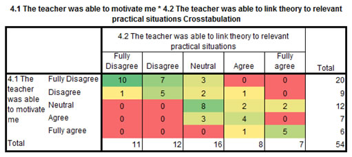
Figure 1. Motivation by teacher vs Teacher link theory to practice.
Click here to see how you can create a heat map...
with SPSS
Creating a heat-map with SPSS has been possible since version 28. Prior to this Excel (or a similar program) was needed to add the colors.
SPSS 28 or later
SPSS 27 or earlier (and Excel)
with R (Studio)
with Python
From the heat map it is now easier to see that on the diagonal left up to bottom right there seem to be some more frequencies than in the other cells. There appears to be some relation between these two variables (perhaps not surprising since both are about the teacher).
To see if the questions about the teacher actually relate to each other the results of the question on the motivation by the teacher and if s/he was able to link the theory to practical situations are shown in Figure 1.
As can be seen Figure 1 it appears that most students answered both questions similar. |
We can test if this relation might actually also exist in the population by performing a statistical test, which will be the topic for the next page.

Google adds