
Multiple Paired Binary Variables
Impression
It is a good idea to start with getting an impression of the data. In the example we asked people which cinemas they visited last year. The results are shown in the table below.
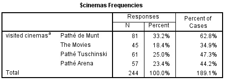
From the table we see that Pathé de Munt is most popular in the sample with 81 visits, and The Movies the least with only 45. The column 'Percent' shows the percentage based on the total number of responses (answer options selected). So for example for Pathé de Munt this is 81/244 x 100 = 33.2. Most often you are probably more interested in the 'Percent of Cases'. This is the percentage based on the number of respondents (cases). In this sample there were 129 people who visited at least one cinema (and another 21 who did not visit any). This means that again for Pathé de Munt this becomes 81/129 x 100 = 62.8%. These Percent of Cases do not add up to 100% since people could choose more than one option.
So 'Percent' is the Percent of Responses, while 'Percent of Cases' is the Percent of Respondents. If you include the Percent of Cases in your report, you might want to add a small line that the percentages do not add up to 100% because it is based on a multiple answers question.
Click here to see how you can generate a frequency table of a multiple response set with SPSS, R, or Excel.
with SPSS
Two options to achieve this, either with Custom tables, or with Multiple Responses. The example used in each of the video is using a slightly different data set than the one used in Table 1 above.
using Custom Tables
using Multiple Responses
with R (also includes bar-chart)
with Excel (also includes bar-chart)
Now that we have a first impression of the data we can visualise the results on the next page.

Google adds