
Multiple paired ordinal variables
Visualisation
To visualise the frequency table of multiple paired ordinal variables, I'd recommend multiple stacked bar-charts.
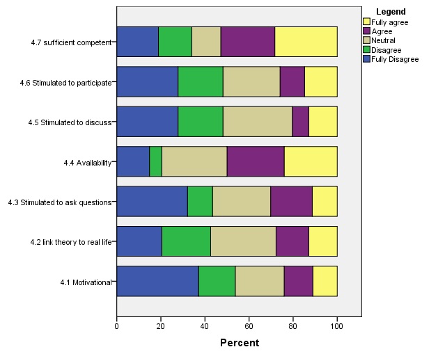
We now again see that the students tend to often (fully) disagree, except for '4.4 availability' and '4.7 sufficient competent'.
Click here to see how to create this table with SPSS, R (Studio), Excel, or Python.
with SPSS (includes table also)
with R (Studio)
with Excel
with Python
Jupyter Notebook from video is available here.
The table and diagram describe our sample data, but what can we say about the population based on our sample? To answer this we will need to perform a statistical test, which is the topic for the next page.
3+ Ordinal variables
![]()

Google adds